Current Steam Page
Capsule Image
Optimized Version
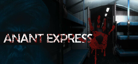
Image Content Analysis
- 1. The title text blends into the background and is partially obscured by the blood splatter, reducing readability; use a bolder, high-contrast font with a clean outline for maximum legibility like Phasmophobia.
- 2. The left side's dark, indistinct figure does not communicate genre or intrigue clearly; replace with a more defined character or focal horror element similar to Outlast's capsule.
- 3. The setting (train interior) is underlit and lacks atmosphere, making it generic; amp up moody lighting and dramatic color contrast to instantly convey horror/suspense, inspired by The Mortuary Assistant.