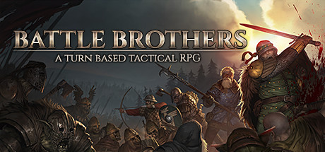
Current Steam Page
Capsule Image

Optimized Version
Image Content Analysis
- 1. The title font blends into the background and lacks strong contrast; adding a bold outline or drop shadow would improve readability, as seen in Darkest Dungeon.
- 2. The detailed background makes the capsule visually busy, diluting the focal point; introducing a semi-transparent gradient behind the text, similar to Slay the Spire, would help the title stand out.
- 3. The genre imagery (medieval combat) is accurate but not prominent; increasing the size and clarity of the main characters or action focus, like in For the King, would better convey the game's core experience at a glance.