Current Steam Page
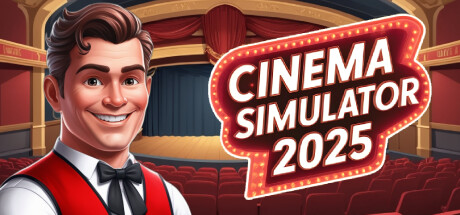
Capsule Image
Optimized Version
Image Content Analysis
- - The logo text is competing with the character and background, making the capsule look crowded and reducing title clarity; use a simpler background behind the text or add a stronger outline to improve readability, as seen in House Flipper.
- - The genre and gameplay are not instantly clear from the capsule art alone; add a key prop or visual cue (like popcorn, tickets, or projectors) to signal "cinema management," similar to the visual shorthand in Gas Station Simulator.
- - The color palette is mostly reds and browns, leading to a flat look; introduce a contrasting color accent or lighting effect to create stronger visual separation and draw the eye, like Two Point Hospital does with its capsule art.