Current Steam Page
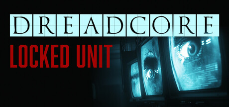
Capsule Image
Optimized Version
Image Content Analysis
- ===
- **Capsule Image Evaluation**
- 1. Art Quality (✔️)
- - The art is polished and cohesive, with a high-contrast, moody aesthetic that fits the theme. The CRT screens and color palette create an atmosphere of tension and surveillance.
- - Tip: —
- 2. Readability (⚠️)
- - "DREADCORE" is nicely separated and readable in black-on-blue tiles, but "LOCKED UNIT"—while legible at full size—may lose sharpness at smaller sizes due to the thinner weight and close spacing. The dark background behind "LOCKED UNIT" doesn't provide quite enough contrast at a glance.
- - Tip: Consider increasing the font weight and spacing of "LOCKED UNIT" or adding a faint shadow/outlining for microcapsule legibility.
- 3. Focus / Visual Hierarchy (✔️)
- - The primary focus goes directly to the titles, with secondary attention on the eye in the monitors. The clean division means nothing competes with the title area.
- - Tip: —
- 4. Hook / Genre Visibility (⚠️)
- - The eerie blue monitors with close-up eyes suggest surveillance and psychological intensity, hinting at horror or thriller roots, but the exact genre isn’t explicit. No direct iconography shows gameplay (e.g., first-person, puzzle, investigation) or highlights whether it's sci-fi, detective, or survival horror.
- - Tip: To clarify genre, consider integrating a subtle overlay—like a UI element, sci-fi glyph, or silhouetted figure—that reinforces if it’s a horror game, detective sim, or something else.
- ===
- **Overall Summary**
- The capsule’s biggest strength is its polished, evocative art and clear, striking layout that quickly sets a surveillance/thriller mood. The greatest improvement needed is genre clarity: visuals communicate tone, but at Steam thumbnail sizes, they won’t instantly tell a new player what core genre or gameplay to expect.
- **Comparative Insight**
- A great comparative example is *Observer* (horror/cyberpunk): its capsule uses strong, creepy facial imagery but overlays genre-defining UI fragments and glitch effects that scream “horror investigation.” *Fear Effect* remastered also uses a bold character silhouette and visual motif relating to gameplay. Using a similar approach—such as layering a subtle but readable gameplay hint—can position *Dreadcore: Locked Unit* for even better discovery among horror/suspense fans.