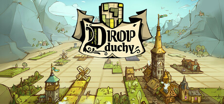
Current Steam Page
Capsule Image

Optimized Version
Image Content Analysis
- 1. The game title is hard to read due to ornate fonts and overlapping elements; use a bolder, clearer typeface with higher contrast like Dome Keeper.
- 2. The overall image lacks a clear, eye-catching focal point; introduce a vibrant, central character or unique structure as seen in For The King.
- 3. The genre and gameplay are not immediately clear; include a visual hook or element (such as tile placement or grid mechanics) similar to Dorf Romantik to quickly signal genre.