Current Steam Page
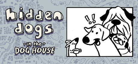
Capsule Image
Optimized Version
Image Content Analysis
- ===
- **Capsule Image Evaluation**
- 1. Art Quality (✔️)
- - The art is polished, charming, and consistent with a cohesive, line-drawn, cartoon style. It feels approachable and friendly, which matches what’s likely a casual or lighthearted experience.
- - Tip: n/a
- 2. Readability (⚠️)
- - The main title, "hidden dogs," is readable due to its thick, playful hand-written font and good color contrast. However, the subtitle "in the DOG HOUSE" is less clear: the "in the" text is small and low-contrast, likely disappearing entirely at small sizes, and “DOG HOUSE” gets a bit crowded with the overlapping strokes and shadow.
- - Tip: Increase the size/weight of the subtitle, especially "in the," and simplify "DOG HOUSE" (brighter fill or bolder outline, fewer effects). Consider cutting the subtitle or using a plain font for clarity.
- 3. Focus / Visual Hierarchy (✔️)
- - Attention is clearly split between the “hidden dogs” title and the cartoon grouping of dog faces. The image uses a two-panel structure that keeps things simple and supports a quick genre read. No major competing elements distract the viewer.
- - Tip: n/a
- 4. Hook / Genre Visibility (⚠️)
- - Dogs and a map-like background hint at a casual, search-based premise, but the *hidden object* mechanic is not immediately evident. The exclamation marks above the dogs’ heads suggest surprise/interaction, which helps, but doesn’t immediately scream “puzzle” or “hidden object” to someone quickly scrolling. “Hidden dogs” as a title does help, but could use reinforcement—at-a-glance, the visual could just be about funny dogs.
- - Tip: Suggest adding a small magnifying glass, a circled area or a peeking paw to visually communicate a search or hidden-object mechanic right in the capsule.
- ===
- **Overall Summary**
- Strength: The capsule is inviting, on-brand, and quickly communicates a dog-centric, lighthearted theme with clean art and engaging characters.
- Biggest improvement: The genre/mechanic isn’t instantly clear for a casual or hidden object game. Subtitle clarity is also weak at small sizes. Use a small visual cue (magnifying glass, highlighting, or a “found!” label) to instantly connect it with hidden-object gameplay, and clarify the subtitle or minimize reliance on it.
- **Comparative Insight**
- Games like *Hidden Folks* and *Where’s My Water?* make great use of capsule space with bold linework, simple but direct iconography (magnifying glasses, searching eyes), and minimal but high-contrast text. *Hidden Folks*, for example, uses strong monochrome art, a single playful focal character, and a clear mechanic hook. Emulate this by reinforcing your core mechanic visually—think about one simple hidden-object icon (magnifying glass, spotlight, or a “circle” finding a dog head)—for instantly improved genre readability.