Current Steam Page
Capsule Image
Optimized Version
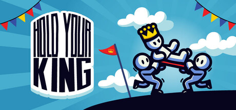
Image Content Analysis
- ===
- **Capsule Image Evaluation**
- 1. Art Quality (✔️)
- - The art is polished, cohesive, and visually appealing, matching a clean "party game" or "casual brawler" style. The palette is bright and saturated, well-suited for catching the eye on Steam.
- - No major issues detected.
- 2. Readability (⚠️)
- - The bold, blocky title is mostly clear, but the vertically stretched font and tight letter spacing reduce legibility, especially for the word "KING." At 120×45px, the tall, compressed type may blur together. The game's subtitle/tagline is missing (might be OK, but could help hook).
- - Tip: Consider using a less stretched, bolder font for "KING," with increased spacing, and test the title at small sizes. Optionally, add a descriptive tagline under the title in a plain font.
- 3. Focus / Visual Hierarchy (✔️)
- - Visual hierarchy is strong: the left side cleanly establishes the game title, and the right side showcases the core character art. The crowned figure is instantly the focal point, and supporting elements don't compete for attention. Background elements (clouds, banners) are subtle and non-distracting.
- 4. Hook / Genre Visibility (⚠️)
- - The image suggests a comedic or casual tone, and the dynamic stick figure scene hints at multiplayer or physics-based action. However, the **genre/mechanic is not immediately clear**: is this a co-op party game, a physics puzzler, or something else? No clues as to gameplay loop, competitive aspect, or direct genre (e.g. party, platformer, brawler).
- - Tip: Add a genre-defining icon or action element (e.g., a thrown object, more chaotic scene, timer, or background crowd) to better anchor the game's hook. An animated crown, trophy, or physical obstacle could further imply the nature of the gameplay.
- ===
- **Overall Summary**
- The image is eye-catching, polished, and immediately communicates a playful tone. The characters and crowned king provide instant visual interest. The **primary improvement** is font readability on the word "KING," and clarifying the genre/hook with an additional visual cue that points to the actual gameplay action or style.
- **Comparative Insight**
- *Move or Die*'s Steam capsule excels at both readability and genre visibility: the bold, clear title is coupled with frenetic character action and clear genre cues (explosions, icons, movement lines). Similarly, *Heave Ho* uses clean stick figures in dynamic situations, with facial expressions and action props hinting at cooperative/competitive play. Taking cues from these capsules, you could heighten the sense of action or chaos and use iconography (e.g., timer, controller, obstacles) to solidify the hook.