Current Steam Page
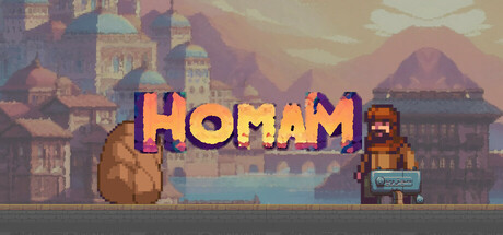
Capsule Image
Optimized Version
Image Content Analysis
- 1. The game title font lacks strong contrast with the background, making it hard to read; increase brightness and add a drop shadow or outline for visibility, similar to how Stardew Valley emphasizes its title.
- 2. The character art blends into the background and doesn’t stand out as the focal point; reposition or increase the size and saturation of the character like Dead Cells, where the hero is clearly the highlight.
- 3. The capsule does not clearly convey genre or gameplay at a glance; include action elements or genre-defining icons as seen with Enter the Gungeon’s use of recognizable, dynamic imagery.