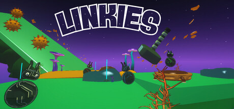
Current Steam Page
Capsule Image

Optimized Version
Image Content Analysis
- ===
- **Capsule Image Evaluation**
- 1. Art Quality (⚠️)
- - The art is clean and consistent, with a colorful, distinctive 3D style. However, the geometry and objects (e.g., the balls and platforms) look a bit simple and static, and the background elements don’t add much depth or atmosphere.
- - Tip: Add subtle lighting/shadows and consider foreground effects, or show more dynamic poses for the characters/balls to inject energy.
- 2. Readability (✔️)
- - The title “LINKIES” is bold, large, and highly readable, even at small sizes. There’s enough contrast, and the font style matches a playful tone. No confusing overlap or background clutter behind the title.
- - Tip: None needed for the title, but if including a subtitle later, ensure it’s equally bold and high-contrast.
- 3. Focus / Visual Hierarchy (⚠️)
- - The eye is drawn first to the title, which is good. However, the game objects below (balls, platforms, obstacles) have similar visual weight, with no clear focal point or single “hook” in the scene. The hammer and orange obstacles also compete visually.
- - Tip: Reduce background clutter and scale up or spotlight one key element (e.g., a hero character or dramatic action moment) to create a strong focal “hook.”
- 4. Hook / Genre Visibility (❌)
- - The image doesn’t clearly communicate the genre or core gameplay. It's unclear what the player does: are the balls the characters? Is this a physics puzzler, platformer, or something else? There’s no obvious action, UI element, or gameplay-defining iconography present. The floating hammer and abstract setting are not self-explanatory.
- - Tip: Show a more recognizable interaction or action (e.g., a ball mid-swing, with an animation trail, or clearly “linking” to something), or add a visual motif common to puzzle platformers (arrows, movement lines, or puzzle pieces) to quickly communicate gameplay.
- ===
- **Overall Summary**
- Biggest strength: The title is highly readable and visually anchors the capsule, and the color palette is inviting.
- Most important improvement: Make the gameplay and genre clear at a glance by highlighting a singular, dynamic game action or interaction, and reduce competing visual elements for clarity.
- **Comparative Insight**
- Compare to a game like *Marble It Up!* — its capsule often shows a dynamic marble in motion with clear platform elements, immediately hinting at physics/platform gameplay. Another strong example is *Human: Fall Flat*, which uses a single character in a playful pose, instantly signaling physics-based puzzle action. Taking cues from these, emphasizing a main character or a unique, readable gameplay moment creates instant genre recognition and a stronger hook.