Current Steam Page
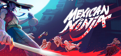
Capsule Image
Optimized Version
Image Content Analysis
- 1. The game title’s font is stylized but the "NINJA" portion is harder to read at a glance; use bolder, cleaner lettering for better instant recognition like "Katana ZERO".
- 2. The main character is pushed to the side, reducing their impact and focal dominance; center or enlarge the protagonist as seen in "Hades" to create a stronger visual hook.
- 3. The background colors and details blend together, making the genre unclear; introduce distinct iconography or action elements similar to "Dead Cells" for immediate genre signaling.