Current Steam Page
Capsule Image
Optimized Version
Image Content Analysis
- ===
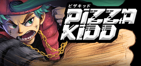
- **Capsule Image Evaluation**
- 1. Art Quality (✔️)
- - The artwork is dynamic, polished, and professionally rendered, with energetic line work and expressive character art that matches an action-packed vibe. The inking and colors are bold, catching the eye well.
- - No improvement needed.
- 2. Readability (⚠️)
- - The title "PIZZA KIDD" has a strong, bold font but is somewhat crowded together with overlapping, stylized letters. The high-contrast white helps, but the dense arrangement makes instant readability difficult at smaller sizes. The Japanese text above is far too small to be legible and may clutter the top edge.
- - Tip: Slightly increase the spacing between the letters or consider simplifying the typography effects for better clarity. Reduce or reposition the small Japanese text so it doesn’t compete with the main logo at capsule scale.
- 3. Focus / Visual Hierarchy (✔️)
- - The central focus is clear: the character’s punch dominates, framing the title and drawing attention to both the character and logo. The visual energy flows from left (character’s face) to right (logo), effectively guiding the eye.
- - No improvement needed.
- 4. Hook / Genre Visibility (⚠️)
- - The punch animation and intense expression suggest action or possibly a fighting game. However, there’s no clear connection to “pizza” or any gameplay hook unique to the theme. The genre could be brawler, beat ‘em up, or platformer, but nothing clearly distinguishes it. If “Pizza” is core to the gameplay or humor, there’s no visual reference (e.g. pizza, toppings, or delivery iconography) to reinforce that part of the hook.
- - Tip: Add a subtle but recognizable pizza-related visual — a slice, box, or topping — integrated into the punch, background, or character outfit to instantly tie the name to the game’s unique flavor.
- ===
- **Overall Summary**
- The strongest aspect is the dynamic, high-energy character art that immediately says “action.” The most important improvement is clarifying both the title readability and the unique theme ("pizza") visually, so the capsule stands out with both clarity and personality at a glance.
- **Comparative Insight**
- *Teenage Mutant Ninja Turtles: Shredder's Revenge* is an excellent reference — its capsule uses bold character focus and vibrant theming (ninjas, green, pizza) to instantly suggest genre and tone. Another good example is *Rival Megagun*, which has clear, bold title and action iconography that are readable at small sizes. Both balance immediate genre cues and logo clarity, ensuring a distinct identity in the Steam library or search list.
- Let me know if you want mockup suggestions or more reference examples!