Current Steam Page
Capsule Image
Optimized Version
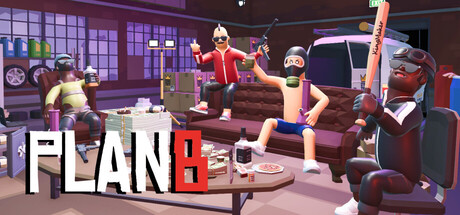
Image Content Analysis
- ===
- **Capsule Image Evaluation**
- 1. Art Quality (✔️)
- - The art is polished, colorful, and consistent with a stylized, cartoon-like in-game aesthetic. Character models and environment match well, enhancing visual appeal.
- 2. Readability (⚠️)
- - The title "PLAN B" is mostly readable, especially the “B” in red for contrast. However, at small sizes the white “PLAN” can bleed into the lighter part of the background, and the detailed background adds noise. Small size may further obscure the letter separation.
- - Tip: Add a subtle dark outline/stroke or drop shadow around the "PLAN" text to increase legibility, and consider darkening/blurring the area directly behind the logo to reduce clutter.
- 3. Focus / Visual Hierarchy (⚠️)
- - The composition is lively, but the three characters and their props (guns, baseball bat, pizza) compete for attention with the title—especially since characters are right by the text, and the pizza box overlaps visually with "PLAN". The overall scene feels slightly crowded, so the eye isn't instantly drawn to the core hook.
- - Tip: Reposition or size down some props, or move the title slightly up/down with a shaped banner/box to give it space and make it pop from the background and characters.
- 4. Hook / Genre Visibility (⚠️)
- - The image suggests a comedic or lighthearted tone (exaggerated expressions, stylized violence), with hints of action or crime (guns, bat, urban garage hangout). However, the genre is still somewhat ambiguous: is it co-op action, party game, or crime sim? There are visual cues (weapons, pizza, attitude), but no direct gameplay indicator or strong genre-defining icon.
- - Tip: Add a genre-defining visual motif in the foreground (e.g., a gameplay UI element, money briefcase, or action icon) or have one character in a dynamic pose (running, aiming) to clarify if this is more action, party, or sim.
- ===
- **Overall Summary**
- Biggest strength: The art is vivid, fun, and immediately expresses attitude and camaraderie, which will attract players looking for irreverent action.
- Most important fix: Make the title more readable and distinct from the background, and clarify the game's genre via an additional visual cue or character pose.
- **Comparative Insight**
- *Gang Beasts* uses its capsule space effectively with very simple, bold character poses and a high-contrast logo against a clean background—making genre and tone obvious even at tiny sizes. *Totally Reliable Delivery Service* is another good reference: it leverages a bright, minimal scene and expressive character to instantly convey wacky physics gameplay and co-op fun. Using a similarly uncluttered style or adding a distinct gameplay icon could boost this capsule's impact.