Current Steam Page
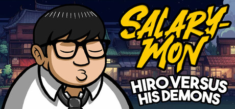
Capsule Image
Optimized Version
Image Content Analysis
- ===
- **Capsule Image Evaluation**
- 1. Art Quality (✔️)
- - The art is polished, consistent with a cartoon style that matches the likely tone of the game. The line work is clean and the character expresses a clear emotion, which adds personality.
- - Tip: N/A
- 2. Readability (⚠️)
- - The main title “SALARY-MON” is bold and high-contrast, very readable even at smaller sizes. However, the subtitle “HIRO VERSUS HIS DEMONS” is getting dense; at small sizes, the stacked all-caps sans-serif can blur together, especially against the detailed background.
- - Tip: Simplify or reduce the subtitle text—consider using just the game’s name or make the subtitle smaller and less visually dominant, or use a subtle drop shadow for separation.
- 3. Focus / Visual Hierarchy (✔️)
- - The image guides attention from the character’s face (placed left, large, expressive) to the game title (large, strong color contrast), then to the subtitle. Visual priorities are clear and there’s minimal clutter; the background does not compete with the title or character.
- - Tip: N/A
- 4. Hook / Genre Visibility (⚠️)
- - The image shows a character in an office shirt/tie, with a backdrop suggesting a Japanese town, and the name “Salary-mon.” It hints at a quirky, perhaps comedic or slice-of-life premise, possibly with Japanese influences, but the *gameplay genre* is unclear. No genre-defining visuals (e.g., combat, puzzles, platforming, monsters) are present. At a glance, it’s hard to tell if this is an adventure game, a sim, or otherwise.
- - Tip: Add a small emblematic prop (e.g., fantasy monster silhouette, paperwork, comedic “demon” peeking in, or even an action gesture) to reinforce the conflict or genre.
- ===
- **Overall Summary**
- Biggest strength: The art style is cohesive and stands out with a memorable, expressive main character and strong, readable logo.
- Most important improvement: Increase genre clarity—add a visual cue that hints at gameplay type or the nature of the “demons” referenced in the title.
- **Comparative Insight**
- *Battle Chef Brigade* uses its capsule to clearly show both its protagonist and a monster/food, integrating action and hook in one visual, making the genre and unique appeal clear. Similarly, *Katana ZERO* puts the protagonist and (in some versions) key action elements front and center, highlighting genre and tone immediately. Either approach could be a model: try including a secondary element or action visual to quickly communicate what makes your game unique beyond the character’s situation.