Spooky Express Analysis

Analyzed on October 19, 2025
1
Capsule Image
2
Short Description
3
Tags
Capsule Image Analysis
Current Steam Page
Capsule Image
Game capsule image
Optimized Version
Image Content Analysis
  • ===
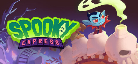
  • **Capsule Image Evaluation**
  • 1. Art Quality (✔️)
  • - The art is polished and cohesive, matching a whimsical, cartoonish in-game style. Colors are vibrant, the shading is confident, and the character design is appealing.
  • - The image feels professionally composed.
  • 2. Readability (✔️)
  • - The title "SPOOKY EXPRESS" is bold and completely legible, even at small sizes. The high-contrast green/purple palette pops against the moody background. The stylized font and little ghost detail fit well.
  • - Tagline/subtitle (if present at all) is small but the main title carries all the weight effectively.
  • 3. Focus / Visual Hierarchy (✔️)
  • - The eye is drawn immediately to the title, then quickly to the central character (vampire in a skull train), thanks to clear positioning and use of color contrast. No distracting overlaps or unnecessary elements.
  • - Strong separation between foreground and background helps the structure.
  • 4. Hook / Genre Visibility (⚠️)
  • - **Partially clear:** The capsule conveys spooky-cute vibes, thanks to the vampire, skull train, and color palette. However, the *exact* genre or gameplay is not obvious—while the "Express" and train suggest motion/travel, it’s unclear if this is platformer, puzzle, management, or adventure. There’s whimsical energy, but no direct hint at the game’s core mechanics (action, platforming, etc.).
  • - Tip: Add a small genre-defining element—e.g., a platform beneath the train, collectible icons, or motion lines. If it’s a fast-paced game, dust/speed effects. If puzzler or management, maybe subtle UI hints or more varied scenery.
  • ===
  • **Overall Summary**
  • Biggest strength: Professional polish, color cohesion, and instantly readable/welcoming title.
  • Most important improvement: Visually clarify the gameplay *genre*; right now, “spooky train adventure” is the only clear message—add a subtle detail or icon reflecting your core gameplay loop.
  • **Comparative Insight**
  • *Unrailed!* uses its capsule to show a train barreling forward with blocky characters, communicating its chaotic coop action at a glance. Similarly, check *Spiritfarer*—shows the boat and passengers, letting players know it’s about travel and relationships. Both use prominent vehicles plus supplemental details (motion, environment, or UI cues) to quickly convey genre. Emulate them by fusing your “spooky express” hook with a gameplay-specific visual element for instant recognition.
Short Description
Current Steam Page
Short Description

All the passengers are dying to ride the Spooky Express! Don’t let them miss their stops: they may be monsters, but they still have places to be and people to eat – er, we mean meet!

Optimized Version
Description Analysis
  • ===
  • **Short Description Evaluation**
  • 1. Length & Structure (✔️)
  • - The length is within the target range and the sentence is concise.
  • 2. Genre Signal (⚠️)
  • - The genre isn't immediately clear. Is it a management game? A puzzle?
  • - Tip: Start with a phrase that signifies the genre, like "Manage a ghastly train," or "Navigate a monstrous rail puzzle."
  • 3. Action & Verbs (⚠️)
  • - "Dying to ride" is clever, but "don't let them miss their stops" lacks a dynamic verb.
  • - Tip: Use more engaging verbs like "juggle," "hurdle," or "orchestrate" to convey the gameplay.
  • 4. Closing Hook (⚠️)
  • - The twist about monsters having places to be is intriguing but doesn't introduce a gameplay mechanic.
  • - Tip: Close with a hint of a gameplay challenge or unique feature, like "Can you satiate their hunger and keep the chaos off the tracks?"
  • 5. Storefront Voice (✔️)
  • - The tone is playful and fits the indie game style.
  • ===
  • **Improved Short Description**
  • Orchestrate chaos on the Spooky Express, where you juggle monstrous passengers with insatiable appetites, ensuring they reach their sinister soirees without devouring each other! (Character count: 181)
  • **Overall Summary**
  • The original description's playfulness was its strongest element. The most vital change was clarifying the game's genre and introducing a gameplay challenge to create a compelling hook for potential players.
  • **Comparative Insight**
  • A game like "Overcooked" uses a similar tone and clear gameplay verbs in its description. This game could take cues from that to emphasize the hectic coordination and dark humor of its gameplay loop.
Tags Analysis
Current Steam Page
Store Tags

Puzzle, Strategy, Cute, Trains, 3D, Isometric, Relaxing, Linear, Casual, Abstract, Cartoony, Colorful, Minimalist, Stylized, Demons, Family Friendly, Logic, Vampire, Zombies, Dark Fantasy

Optimized Version
Tag Analysis
  • TAG_SCORE: ✔️
  • SUGGESTED_TAGS:
  • ["Management", "Time Management", "Wholesome", "Monster", "Funny", "Cute", "Family Friendly", "Casual", "Isometric", "Trains"]
  • TAG_EVALUATION:
  • - ✔️ "Puzzle" – Fits if the core gameplay involves solving passenger routing or scheduling.
  • - ✔️ "Strategy" – Justified if players plan routes or manage timing under constraints.
  • - ✔️ "Cute" – Matches tone if visuals are bright and characters are endearing.
  • - ✔️ "Trains" – Highly relevant to setting and core mechanics.
  • - ✔️ "3D" – Appropriate if the game uses 3D graphics.
  • - ✔️ "Isometric" – Accurate if the camera angle is isometric.
  • - ✔️ "Relaxing" – Fits if the game avoids high-pressure fail states or frantic pacing.
  • - ⚠️ "Linear" – Only relevant if levels are strictly sequential with little player choice.
  • - ⚠️ "Abstract" – Downplay unless visuals/gameplay are truly nonrepresentational.
  • - ✔️ "Cartoony" – Fits if art is exaggerated or comic-like.
  • - ✔️ "Colorful" – Good if palette is bright and visually engaging.
  • - ⚠️ "Minimalist" – Downplay unless UI/art is very stripped down.
  • - ✔️ "Stylized" – Accurate for non-photorealistic visuals.
  • - ✔️ "Demons", "Vampire", "Zombies" – Reasonable if these are featured monsters, but should not dominate tags unless core to gameplay.
  • - ⚠️ "Family Friendly" – Use only if themes/content are appropriate for all ages.
  • - ✔️ "Logic" – Fits if puzzles require step-by-step deduction.
  • - ⚠️ "Dark Fantasy" – Downplay unless the tone is genuinely dark or creepy rather than comedic/spooky.
  • DISCOVERY NOTES:
  • - Current tags capture the puzzle/trains/monster combo, but could better emphasize the management and time-based aspects if present.
  • - The tone seems comedic/spooky, not genuinely "Dark Fantasy," so tags like "Wholesome," "Funny," and "Monster" may increase reach to the right audience.
  • - Some tags like "Abstract" and "Minimalist" may mislead unless they truly reflect the visual or gameplay style.
  • ACTION STEPS:
  • - ADD: "Management", "Time Management", "Monster", "Funny", "Wholesome" (if gameplay and tone support these).
  • - DOWNPLAY: "Abstract", "Minimalist", "Dark Fantasy" unless core to design/aesthetic.
  • - RETAIN: "Puzzle", "Strategy", "Trains", "Cute", "Isometric", "Cartoony", "Colorful", "Relaxing", "Family Friendly" (if accurate).
  • - EMPHASIZE in marketing/assets: The monster passenger theme, comedic/spooky tone, and lighthearted management gameplay to attract family, cozy, and casual players.
  • - REMOVE from prominent store positioning: "Abstract", "Minimalist", "Dark Fantasy" if not central to the experience.