Current Steam Page
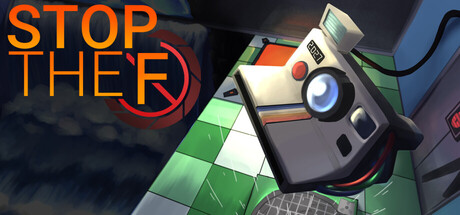
Capsule Image
Optimized Version
Image Content Analysis
- ===
- **Capsule Image Evaluation**
- 1. Art Quality (✔️)
- - The art is clean, polished, and internally consistent. The stylized rendering of the camera and the environment is visually appealing and matches the likely in-game aesthetic.
- - No major issues; the highlight and shadow work give the image depth.
- 2. Readability (⚠️)
- - The first two words “STOP THE” are clear and legible. However, the “F” feels incomplete and the red circle partially occludes it, making the full title ambiguous—especially since it seems like the rest of the word is intentionally omitted or obscured. At smaller sizes, this could be misread or lose impact.
- - Tip: Consider revealing more of the final word, or stylize it in a way that the *intentional partial reveal* is still instantly understandable as part of the game’s title at 120×45px. If that’s not possible, clarify with a subtitle or additional visual cue.
- 3. Focus / Visual Hierarchy (✔️)
- - The composition guides attention well: Title text anchors the left, the camera device angles in from the right, drawing the eye diagonally across the image. The space isn’t overcrowded, and the mechanical object adds intrigue.
- - No major competing or cluttering elements.
- 4. Hook / Genre Visibility (⚠️)
- - The image suggests some puzzle/sci-fi elements (from the grid floor, technological device, and dramatic lighting), but it’s not immediately clear what genre this is—puzzle, strategy, escape room, or something else? The camera is unique, but *how* it’s used (or its significance in gameplay) is not visually hinted. There’s tension, but no overt action or genre cues.
- - Tip: Add a visual element communicating the core mechanic—e.g., a time-stop effect, grid manipulation, puzzle piece, or visual echo from the camera. Subtly showing a “frozen” environment, or another gameplay-relevant effect tied to the camera, would make the genre/hook clearer at a glance.
- ===
- **Overall Summary**
- Biggest strength: Bold, polished art and strong composition guide the viewer’s eye effectively, making it look professional and inviting.
- Most important improvement: Clarify the genre and core hook by visually tying the camera to its gameplay function, and ensure the title reads clearly and unambiguously at a small size.
- **Comparative Insight**
- Compare to *Superliminal* or *The Pedestrian*—both puzzle games with visual capsules that emphasize a single, iconic mechanic or moment (e.g. warped perspective, signage walking). They use strong central focus and subtle genre cues (like visual manipulation or signage motifs) that quickly broadcast “puzzle” and “mind-bending gameplay.” Study how those capsules communicate *both* their hook and genre with a minor prop or effect layered in—aim for that instant recognition and curiosity.