Current Steam Page
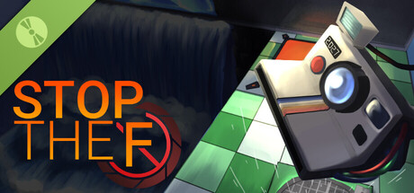
Capsule Image
Optimized Version
Image Content Analysis
- ===
- **Capsule Image Evaluation**
- 1. **Art Quality (✔️)**
- - The art is polished and consistent, with a clean digital painting style that matches the quirky, puzzle vibe. The isometric grid and lighting are appealing and the objects are well-rendered.
- - No major improvements needed.
- 2. **Readability (⚠️)**
- - “STOP THE F” is fairly readable in large format but the "F" is almost entirely obscured by the red aperture icon, making it confusing at Steam thumbnail sizes. The thin orange font doesn’t contrast enough against the busy background, and smaller text may be lost entirely.
- - **Tip:** Simplify the background behind the title with a dark overlay or shadow, and consider moving or resizing the aperture icon so the “F” is fully legible. Try a thicker font weight for better readability at 120x45px.
- 3. **Focus / Visual Hierarchy (⚠️)**
- - The composition pulls the eye in two directions: the camera and the left-side text compete for attention. The strong diagonal and clutter of the tiled floor may distract from both main elements.
- - **Tip:** Increase spacing between the camera and the text, or darken/simplify areas that aren’t focal. Anchor the player’s eye with a clear foreground (title) and background (environment/mechanic).
- 4. **Hook / Genre Visibility (⚠️)**
- - The image hints at puzzle gameplay via the tiled floor and camera, but genre and hook aren’t clear at a glance. Is the game about photography puzzles, time manipulation, or something else? There’s no action or puzzle-defining element (like a puzzle piece, time symbol, or snapshot effect).
- - **Tip:** Add a visual cue that communicates your hook—like a photo frame being ejected with a freeze-frame effect or a puzzle tile “stopping” in motion. Small iconography or effects (shattered lines, paused animation, etc.) can clarify genre quickly.
- ===
- **Overall Summary**
- The art style is appealing and has a polished, inviting look. The core issue is unclear, hard-to-read title text, and a lack of obvious genre/hook cues in the thumbnail. Prioritize font legibility and add a visual hint about the game’s core mechanic for instant recognition.
- **Comparative Insight**
- *Baba Is You* uses its capsule brilliantly: the stark pink background, clear block letters, and iconic main character instantly communicate “puzzle, quirky, smart.” *The Pedestrian* also works well, leveraging clear signage iconography to echo its unique puzzle platforming. Both use strong contrast and instantly recognizable motifs for discoverability; consider their approach to visual clarity and succinct genre communication as inspiration.