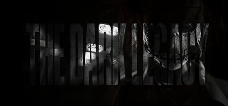
Current Steam Page
Capsule Image

Optimized Version
Image Content Analysis
- ===
- **Capsule Image Evaluation**
- 1. Art Quality (✔️)
- - The art is atmospheric and consistent, with a dark, gritty tone fitting for horror. The partial reveal of the creepy, stitched face is unsettling in a polished way and matches what one might expect from an in-game visual.
- - No major quality issues noted.
- 2. Readability (❌)
- - The title "THE DARK LEGACY" is very hard to read, especially at capsule size. The font is heavily textured and transparent, blending into the busy background of the masked character’s face and reducing contrast. At 120×45 px, this will become nearly illegible.
- - Tip: Use a solid, high-contrast font for the title (e.g., white or red on black), and consider adding a subtle drop shadow or dark outline. Reduce texture on the text in this context.
- 3. Focus / Visual Hierarchy (⚠️)
- - The image has strong mood, but the busy overlap of large text with the detailed face causes them to compete for attention. The focal point isn't clear; the eye bounces between the unreadable title and the intriguing character, with neither winning.
- - Tip: Anchor the focus. Either shrink the character and move it beside/behind the title, or fade the background further behind the text so the title is dominant.
- 4. Hook / Genre Visibility (⚠️)
- - The dark, creepy visual gives a strong horror vibe, but there’s ambiguity in what kind of horror experience it might be (survival, stealth, psychological, etc.). There’s no genre-defining iconography (weapon, setting, first-person hint), just a mood.
- - Tip: Try to incorporate a small, clear mechanic or genre cue—bloody weapon, flashlight, or a survival HUD element—so the viewer can identify the subgenre instantly.
- ===
- **Overall Summary**
- Strength: The atmospheric, creepy art immerses the viewer and suggests horror.
- Priority: Make the title readable—without it, the capsule loses context and becomes unclickable on Steam. Clarify visual hierarchy, and add a subgenre “hook.”
- **Comparative Insight**
- Look at *Outlast*'s capsule: high contrast between title and background, iconic protagonist visage, and the genre is instantly clear from just a flashlight and desperate expression. Another useful reference is *Dead by Daylight*, where the killer’s silhouette and clear, white logo guide focus. These capsules use solid text and simple, high-impact imagery with instant genre signaling.
- By increasing title readability and hinting clearly at the game’s unique horror angle, your capsule will convert better and stand out in crowded listings.