Current Steam Page
Capsule Image
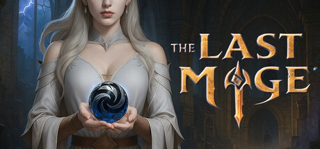
Optimized Version
Image Content Analysis
- - The muted color palette blends character and background, reducing immediate visual impact; increase contrast between the character, orb, and background for stronger separation, similar to Hades.
- - The font style and placement are good but the subtitle and orb almost merge visually; enlarge or brighten the orb or add a glow for a clear focal point, as seen in Dead Cells.
- - Lack of explicit genre signaling (such as spell effects or fantasy creatures) weakens at-a-glance understanding; add magical effects or iconic fantasy elements, like Slay the Spire does with instantly recognizable visuals.