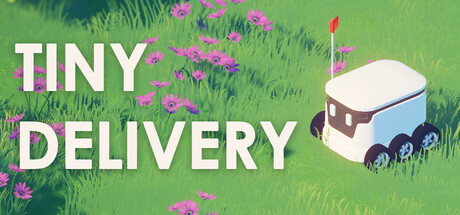
Tiny Delivery Analysis

Analyzed on July 19, 2025
1
Capsule Image
2
Short Description
3
Tags
Capsule Image Analysis
Current Steam Page
Capsule Image
Game capsule image
Optimized Version
Image Content Analysis
  • ===
  • **Capsule Image Evaluation**
  • 1. Art Quality (✔️)
  • - The art is polished, clean, and consistent with a soft, appealing style. The delivery robot feels cohesive with the environment, and the color palette is inviting.
  • - Tip: N/A
  • 2. Readability (✔️)
  • - The title "TINY DELIVERY" is very clear, high-contrast, and readable even at small sizes. The large, sans-serif typeface and white color pop well against the green background. No subtitle/tagline present, but the space is effectively used without unnecessary clutter.
  • 3. Focus / Visual Hierarchy (✔️)
  • - Attention is well-guided. The robot and the title are easily the focal points, with plenty of breathing room between elements. Nothing distracts from the core message—no overlapping or strong background clutter.
  • 4. Hook / Genre Visibility (⚠️)
  • - The image hints at a cute, possibly relaxing or whimsical game due to the style and robot, but the genre and core gameplay mechanic are ambiguous. While the delivery robot suggests some kind of delivery or transport mechanic, there are no clear indicators if it's a puzzle, action, or strategy game. The soft field of flowers doesn’t give any "delivery challenge" context (e.g., obstacles, packages, or a map/destination arrow).
  • - Tip: Consider adding a small visual element (like a package, waypoint marker, or path) to strengthen the hook and clarify the gameplay loop at a glance.
  • ===
  • **Overall Summary**
  • Biggest strength: The capsule is clean, readable, and visually appealing, with an instantly recognizable robot character anchoring the composition.
  • Most important improvement: Clarify the gameplay genre and core mechanic visually—right now, players may not grasp what kind of experience they're getting beyond "cute robot in a field."
  • **Comparative Insight**
  • Look at the capsule for *Unpacking*: it uses one or two strong visual cues (moving boxes, packing tape) to instantly convey its core mechanic with minimal clutter. Alternatively, *Dorfromantik*’s capsule uses small, iconic tokens (tiles) that tell you it’s a cozy puzzle/strategy game. These work because they lean heavily on genre-defining iconography—a single detail like a pickup/delivery item, map overlay, or route marking could do the same for *Tiny Delivery*.
Short Description
Current Steam Page
Short Description

It’s a cozy adventure about a small delivery robot on a short but unforgettable journey. Deliver your package through a vibrant town, meet new people, stumble upon both funny and touching moments, discover hidden treasures, and soak in the world around you.

Optimized Version
Description Analysis
  • ===
  • **Short Description Evaluation**
  • 1. Length & Structure (⚠️)
  • - The length is under 300 characters, but the structure could be tighter and more skimmable.
  • - Tip: Streamline the description by eliminating less impactful phrases like "soak in the world around you."
  • 2. Genre Signal (⚠️)
  • - The genre (adventure) is mentioned, but the core gameplay fantasy isn't clear.
  • - Tip: Lead with a clearer indication of the gameplay style or mechanics.
  • 3. Action & Verbs (⚠️)
  • - Verbs like "deliver," "meet," and "discover" are relevant but could be more dynamic and gameplay-focused.
  • - Tip: Replace softer verbs with more tactile and immediate action words that relate directly to gameplay.
  • 4. Closing Hook (❌)
  • - The closing line is weak; it lacks a sense of tension or mystery.
  • - Tip: Finish with a gameplay element that teases a unique twist or challenge.
  • 5. Storefront Voice (⚠️)
  • - The tone is friendly and inviting but lacks the energetic confidence seen in modern indie game marketing.
  • - Tip: Use a more direct, punchy style to reflect the energy of the game and engage the audience.
  • ===
  • **Improved Short Description**
  • Embark on a vibrant adventure as a plucky delivery robot, racing to complete your mission! Navigate a bustling town, forge connections, uncover secrets, and make every delivery an event to remember. Will your circuits handle the heartwarming overload? (Character count: 239)
  • **Overall Summary**
  • The strongest element of the original was its cozy, inviting atmosphere. The most important change was to inject more immediate, engaging verbs that better reflect the game’s active adventures, while maintaining the charm. This approach should increase user engagement by offering clear, enticing gameplay promises.
  • **Comparative Insight**
  • A similar game with a strong short description is "A Short Hike" which immediately signals its exploration and playful movement mechanics, creating an inviting sense of adventure. Adopting a similarly clear and vivid description can help this game stand out.
Tags Analysis
Current Steam Page
Store Tags

Adventure, Exploration, Indie, Puzzle, Cute, Emotional, Relaxing, Atmospheric, Stylized, Physics, 3D, Skating, Linear, Top-Down, Isometric, Nature, Singleplayer, Casual, Walking Simulator, 3D Platformer

Optimized Version
Tag Analysis
  • TAG_SCORE: ⚠️
  • SUGGESTED_TAGS:
  • ["Wholesome", "Short", "Story Rich", "Third Person", "Colorful", "Adventure", "Relaxing", "Cute", "Exploration", "Walking Simulator"]
  • TAG_EVALUATION:
  • - ✔️ "Adventure" – Core to the game's exploratory progression and narrative.
  • - ✔️ "Exploration" – Central activity; discovering the town and secrets.
  • - ✔️ "Indie" – Accurate for a small-scale, independently developed title.
  • - ⚠️ "Puzzle" – Only keep if puzzles are a major gameplay element; otherwise, downplay.
  • - ✔️ "Cute" – Fits the cozy, charming presentation and robot protagonist.
  • - ✔️ "Emotional" – If the story genuinely aims for heartfelt or touching moments.
  • - ✔️ "Relaxing" – Essential for tone and audience; gameplay appears low-stress.
  • - ✔️ "Atmospheric" – Strong fit given focus on vibe and world immersion.
  • - ✔️ "Stylized" – Relevant if art direction is non-photorealistic and distinctive.
  • - ⚠️ "Physics" – Only appropriate if physics interactions are central (e.g., physics-based puzzles); otherwise, misleading.
  • - ✔️ "3D" – Correct if the game is visually 3D.
  • - ❌ "Skating" – Misleading unless movement is skating-based or a major mechanic.
  • - ⚠️ "Linear" – Acceptable if the game is strictly linear, but not a discovery driver.
  • - ⚠️ "Top-Down"/"Isometric" – Only use one if the camera is fixed to that angle; otherwise, misleading/confusing.
  • - ✔️ "Nature" – Appropriate if outdoor/natural environments are significant.
  • - ✔️ "Casual" – Relevant for low-pressure, approachable gameplay.
  • - ✔️ "Walking Simulator" – Good fit if focused on exploration and narrative over challenge.
  • - ⚠️ "3D Platformer" – Misleading unless jumping/platforming is a core mechanic.
  • DISCOVERY NOTES:
  • - Current tags capture mood and genre, but some (e.g., "Skating", "Physics", "Top-Down"/"Isometric") may confuse players if not central to gameplay.
  • - "Wholesome", "Short", and "Story Rich" would strongly improve discovery for players seeking cozy, compact narrative experiences.
  • - Overemphasizing "Puzzle" or "3D Platformer" could attract the wrong audience if not core mechanics.
  • ACTION STEPS:
  • - REMOVE/DOWNPLAY: "Skating", "Physics", "3D Platformer", "Puzzle" (unless these are core gameplay elements); only keep "Top-Down" or "Isometric" if the camera is consistently one or the other.
  • - ADD: "Wholesome", "Short", "Story Rich", "Third Person", "Colorful" to the store tag list.
  • - REFOCUS: Emphasize "Wholesome", "Relaxing", and "Cute" in store copy and assets; highlight narrative and cozy exploration in screenshots and trailers.
  • - VALIDATE: Ensure only accurate camera tags ("Third Person", "Top-Down", "Isometric") are used, depending on actual gameplay perspective.