Current Steam Page
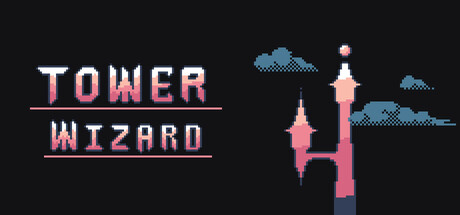
Capsule Image
Optimized Version
Image Content Analysis
- - The title font blends with the background and lacks punch; use higher contrast colors and a slight glow or outline for improved readability, similar to Celeste.
- - The capsule is visually unbalanced with excessive empty space; introduce a central character or dynamic element near the tower for instant genre/hero recognition like Dead Cells.
- - There's minimal genre signaling; add subtle but clear motifs (magic effects, spell icons) to immediately convey the fantasy/action theme as seen in Slay the Spire.