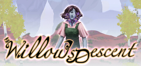
Current Steam Page
Capsule Image

Optimized Version
Image Content Analysis
- ===
- **Capsule Image Evaluation**
- 1. Art Quality (✔️)
- - The art is polished, visually cohesive, and atmospheric. The character design is original and immediately draws the eye. The background feels intentional and complements the foreground without overtaking it.
- 2. Readability (⚠️)
- - The game title is stylized, but the looping script font and the overlap with the background (especially around "Willow’s" and the “sDescent” conjunction) reduce legibility—especially at the small “discovery queue”/library size.
- - Tip: Opt for a bolder, cleaner font or add a stronger outline/drop shadow against the background to keep the title crisp and legible at a glance.
- 3. Focus / Visual Hierarchy (⚠️)
- - The main character is well-placed, but her head nearly intersects with the title, creating visual competition. The script font is elaborate, which pulls focus from her and muddles the hierarchy, especially in miniature.
- - Tip: Increase spacing between the title and the character’s head/shoulders, or anchor one clearly in the foreground/background. Make sure the character or the logo is the clear focal point, not both at once—ideally, title low, character high.
- 4. Hook / Genre Visibility (❌)
- - The image suggests some fantasy or surreal elements, but does not clearly communicate core gameplay, genre, or hook. The character’s style is distinctive, but there’s no action, iconography, or environmental clue to clarify if this is adventure, puzzle, or narrative-centric.
- - Tip: Add a genre-defining element (platform, magic glyph, mysterious artifact, silhouette of an enemy, etc.) or visual effect (e.g., glowing light, falling objects, etc.) to hint at the key mechanic or conflict and quickly situate the viewer in the right genre.
- ===
- **Overall Summary**
- Biggest strength: The capsule’s art is distinctive and cohesive, with a clearly original character design that stands out from generic assets. Most important improvement: Sharpen the title’s legibility and add an unmistakable genre visual cue to communicate what kind of game this is, especially at small sizes.
- **Comparative Insight**
- Games like *Gris* use soft, atmospheric painterly backgrounds but always anchor either a genre icon (platform edge, mystical power, falling protagonist) or bold, clean logo to define space and function clearly—demonstrating genre and tone while retaining instant readability. Yours could benefit from integrating a strong genre-defining silhouette (think *Ori and the Blind Forest*’s branch/platform or *Celeste*’s mountain motif) to make the fantasy or adventure theme unmistakable at a glance.